Google has completed the transition of Gemini’s overlay on Android from its older blue-purple theme to the four Google colors. The update brings a vibrant and modern look, with one small exception still visible. The change enhances visual consistency across Android, iOS, and the web. Starting in late June, the four-color icon arrived on both Android and iOS apps. It also updated the “Hello” greeting on the homepage to blue, which is now Gemini’s primary accent color. This design refresh soon came to the website, softening the sparkle icon for a smoother look.

On Android, the updated Gemini overlay is triggered by swiping up from the bottom corners or long-pressing the power button. It began rolling out to users in early July. Beta testers received it earlier this week, and it is now available to all stable users with Google app version 16.30. Users should update the app via the Play Store to access the changes.
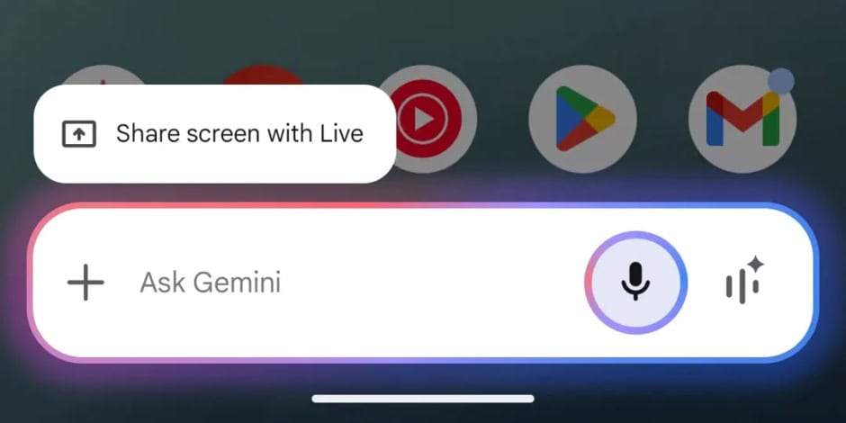
The animation now unfolds in two stages. On launch, it displays red, yellow, green, and blue colors. However, light blue soon becomes dominant, replacing the others. The microphone ring indicator also matches this light blue shade.

Compared to the old design, the new palette feels more vibrant and polished. Colors adjust slightly based on the device’s light or dark theme.
One element still retains the older icon, the Recents multitasking menu. This is because the Google app powers the overlay’s functionality. Meanwhile, the “Google Gemini” app from the Play Store handles the homescreen icon, widget, and system share sheet targets.