- Microsoft just deployed two new preview builds for Windows 11
- One of these improves File Explorer in dark mode, and another boosts its performance
- There’s also a useful change for some taskbar flyout panels, but it’s not the big taskbar move that some folks have been clamoring for
Microsoft[1] is working to improve both the look and performance of File Explorer[2] in the most recent preview versions of Windows 11, as well as introducing a much-wanted feature for taskbar flyout panels.
In the new preview build released in the Dev channel, Microsoft notes[3] that it’s made Windows 11[4]‘s dark mode more consistent so it applies to more parts of File Explorer (the app which powers the folders you use on the desktop).
This means that now (in testing), dark mode is applied to the panels that pop up in File Explorer when you’re copying, moving, or deleting files, and also in dialog boxes for confirmations (like okaying a deletion, or skipping a file copy as the item already exists in the destination folder).
Error pop-ups also now appear in dark mode, and progress bars (percentage complete) too. All of these elements in File Explorer are currently jarring because they still have white backgrounds, even with dark mode turned on. If all this sounds rather familiar, it’s because these changes were previously spotted hidden in test builds[5].
Elsewhere in another new build in the Canary channel (the earliest testing platform for Windows 11), Microsoft explains[6] that it has: “Made some underlying changes to help improve the performance of launching cloud files from File Explorer and loading context menus.”
Context menus are the ones that appear when you right-click on a file, and they can be slow to load going by some reports from frustrated Windows 11 users, who rightly complain about File Explorer performance in general[7].
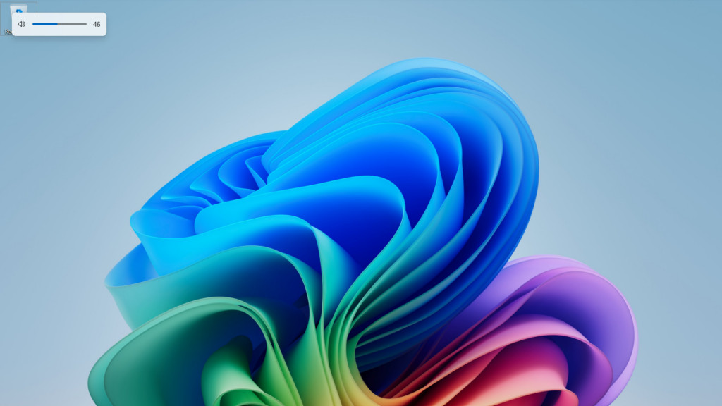
Also in that Canary build, Microsoft reveals that: “We’re excited to introduce a highly requested setting, the option to move the hardware indicators for brightness, volume, airplane mode, and virtual desktops to different positions on your screen.”
So, this is a taskbar-related tweak in that it applies to panels (hardware indicators) for settings that are accessed in that bar (mostly from the system tray, at the far right of the taskbar).
What Microsoft is allowing you to do here is to change where these flyout panels appear. By default in Windows 11, they are summoned at the bottom center of the desktop, but new options enable the placement to be adjusted to the top center, or top left, if you prefer.
Analysis: And while you’re at it, Microsoft…

I don’t want to be over-critical of Microsoft, but I do have a slight niggle regarding the latter change, albeit a rather tangential one.
Okay, so there’s no doubt that this is a great feature to add, especially for repositioning the volume bar so it doesn’t obscure captions or subtitles at the bottom of the screen in movies or games when you tweak the volume. Better customization choices for the desktop are certainly a boon, too.
However, if you’re going to talk about “highly requested” features for the taskbar and its related flyouts, the main bugbear for some is the inability to move the bar itself. In Windows 10[8], it’s possible to shift the taskbar away from the bottom of the screen to locate it at the sides, or top – but you’re stuck with the bar at the bottom of the desktop in Windows 11.
Will Microsoft ever apply that frequently-requested change which some folks have been clamoring for ever since the wraps were taken off Windows 11? It’s starting to feel like it won’t happen, frankly, and it’s baffling that this functionality didn’t get ported over to the newer OS in the first place (doubtless due to technical, under-the-hood reasons).
Don’t get me wrong, I do very much welcome the customization of taskbar flyouts, though I question why the volume bar was ever placed at the foot of the screen anyway, given that this is inevitably where captions or subtitles are positioned. (In Windows 10, you can’t move these slider panels either – but the volume appears at the top-left by default, not at the foot of the screen).
As for File Explorer performance, the work seen here is part of an ongoing drive by Microsoft[9] to improve the responsiveness of this area of the Windows 11 interface. I’m keeping my fingers crossed that as well as faster right-click menu performance, the tweaks to pep up “launching cloud files” might help the overall speed of File Explorer, as some have theorized that syncing cloud files[10] is one of the major factors slowing things down for some Windows 11 users. (And Microsoft has even admitted there are issues here[11], without specifically relating them to File Explorer).
Follow TechRadar on Google News and add us as a preferred source to get our expert news, reviews, and opinion in your feeds. Make sure to click the Follow button![12][13]
And of course you can also follow TechRadar on TikTok for news, reviews, unboxings in video form, and get regular updates from us on WhatsApp too.[14][15]
You might also like…
References
- ^ Microsoft (www.techradar.com)
- ^ File Explorer (www.techradar.com)
- ^ Microsoft notes (blogs.windows.com)
- ^ Windows 11 (www.techradar.com)
- ^ previously spotted hidden in test builds (www.techradar.com)
- ^ Microsoft explains (blogs.windows.com)
- ^ complain about File Explorer performance in general (www.techradar.com)
- ^ Windows 10 (www.techradar.com)
- ^ ongoing drive by Microsoft (www.techradar.com)
- ^ theorized that syncing cloud files (www.techradar.com)
- ^ Microsoft has even admitted there are issues here (www.techradar.com)
- ^ Follow TechRadar on Google News (news.google.com)
- ^ add us as a preferred source (www.google.com)
- ^ follow TechRadar on TikTok (www.tiktok.com)
- ^ WhatsApp (whatsapp.com)