
New listing business has been one of the few bright spots for real estate agents in a down market. But that light dimmed a bit this summer. With Inman Market View’s detailed maps and multi-market comparisons, take an interactive dive into the numbers most important to you.
As the housing market cooled substantially over the past two years, the dearth of buyers was a key culprit.
But less appreciated is the role that homeowners played in this rebalancing process.
The number of new listings that hit the market from June through August was 11 percent higher than it was two summers earlier, a sign of how sellers have gradually grown more comfortable dipping their toes in the water.
But in many places throughout the country, that momentum in new inventory — perhaps the healthiest part of the current downturn and rebalancing — slowed substantially this summer.
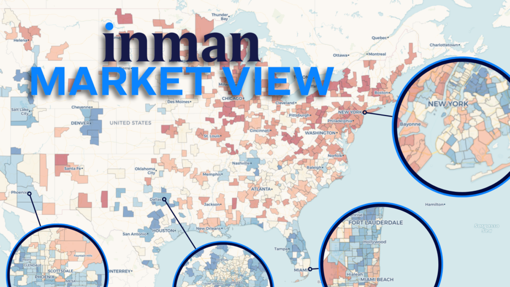
To give real estate agents and brokerage leaders a chance to see where their market falls, the Inman data team has updated its Market View series of interactive tools[1] with the latest numbers[2] this week from Realtor.com.
And in much of Florida, parts of California and pockets of the Midwest, less new inventory came online this summer than at the same point last year.
Explore the interactive map below to see how your market fared.
These tools are designed to be responsive and interactive, so feel free to explore the data by toggling between different metrics and time periods. Select a market from either the dropdown menu or the map to drill down for a more detailed, hyperlocal view of what’s going on near you.
One thing that’s not immediately obvious from the map above is that the annual growth in new listings has been weakening a bit from the spring to the summer, even in places where new listings remain up or steady year-over-year.
That’s where the interactive Inman Market Trends chart tool steps in to fill the gap.
In metros like Denver, Washington, Atlanta and Dallas, a substantial annual boost in new listings that occurred in the spring was stunted in the summer.
Select your local market, and up to three more, to see how the three-month average has changed over time in several key metrics and across multiple time-comparison views.
What is outflow, exactly?
In the tools above, two of the metrics — listing outflow and the estimate of a market’s potential revenue pool that it informs — warrant a particularly cautious reading at this moment in real estate.
Put simply, listing outflow represents the monthly number of properties that left the active-listing pool. Importantly, this can represent one of two very different events: an active listing going pending or a listing being withdrawn from the market.
In most parts of the country historically, there are far fewer delistings than transactions. For this reason, previous detailed Inman reviews of listing outflow patterns demonstrated that changes in listing outflow tend to closely follow home-sales trends over time. This is especially true when comparing periods on a year-over-year basis or against a pre-pandemic baseline, when the ratio of delistings to sales often remains similar for many geographies.
But in this unusual moment, delistings appear to be making an outsized imprint on the change in outflow numbers.
Parts of Florida, Arizona and California were hit particularly hard by delistings in recent months, according to a Realtor.com analysis this week accompanying the data’s release.
And while multiple independent measures of sales and mortgage applications show a year-over-year increase in transaction activity, the rise in delistings is inflating this trend in terms of listing outflow.
- The number of delistings was 57 percent higher in July than at the same point last year, Realtor.com reported. That’s an acceleration from June, when delistings were up 48 percent year-over-year.
Taken together, these observations suggest that recent changes in outflow levels should not necessarily be interpreted as potential sales or revenue boosts.
Inman Market View will continue to track outflowing listings in the months ahead, as they provide a generally useful proxy for housing market activity over time. But for now, interpret this Inman-calculated metric with caution.
References
- ^ series of interactive tools (www.inman.com)
- ^ the latest numbers (www.realtor.com)
- ^ Email Daniel Houston (www.inman.com)