
In a recent defense of Republican efforts to redraw Texas’ congressional maps with a greater Republican advantage, Vice President JD Vance criticized the current maps in California as an extreme gerrymander. There, he suggested, Democrats had already given themselves an egregious number of safe blue seats in Congress.
While Mr. Vance ignored that California’s maps are drawn by an independent commission, not Democrats, he cited a seemingly simple statistic as proof: the partisan breakdown of the state’s congressional delegation as compared with the statewide partisan vote share.
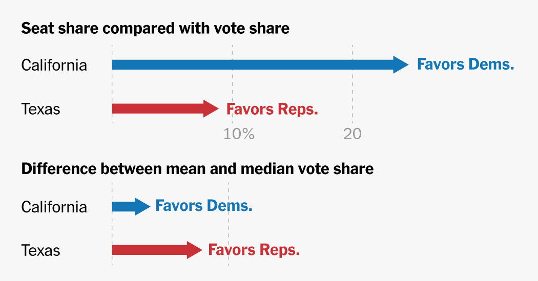
Seat share compared with vote share
Democrats control about 80 percent of California’s seats in the U.S. House but earned roughly 60 percent of the statewide vote in the 2024 presidential election, a more than 20 percent point disparity. Texas Republicans won 58 percent of the vote, yet hold 66 percent of the seats — an 8-point gap.
But this statistic, taken by itself, ignores several critical factors, like how voters are geographically sorted in a state; how close the elections were in some of those congressional districts; the importance of protecting the rights of voters of color; and the ability of a popular congressional incumbent to run against statewide trends.
The comparison between seat share and vote share is one of many useful, but imperfect, measures experts use to quantify gerrymandering, or the intentional distortion of political districts to give one party an advantage in elections.
In fact, different measures can produce very different pictures of gerrymandering. For example, by one metric, known as the mean-median difference, Texas districts favor Republicans more than California districts favor Democrats.
Mean-median difference
Both the seat-to-vote share and the mean-median difference metrics can reveal extreme gerrymanders — especially in closely divided states like North Carolina — but there are flaws in nearly every purely statistical model when it comes to assessing the fairness of a state’s maps.
Congressional seats compared with vote share
While California’s map clearly has a Democratic tilt, there are many Congressional delegations that are out of sync with their statewide partisan vote share. Some are indeed the result of partisan gerrymandering, such as Illinois, North Carolina, Maryland and Texas. Others, like Massachusetts, are more the result of political sorting, an increasingly common feature in American politics in which voters move into like-minded counties or communities.
House seat advantage
In the case of California, whose maps were drawn by an independent commission, not partisan legislators like in Texas, Republican voters are more spread out across the state. They occupy less populated swaths in the eastern part of the state and also live in pockets within a larger Democratic area.
Republican voters’ relative sparseness presents a challenge for California’s independent commission, which also must take geographic continuity, compactness and contiguity into account when drawing new maps every decade.
The commission also placed a strong emphasis on representation for communities of color, meeting the requirements of the Voting Rights Act and drawing Latino-majority seats that are also Democratic in areas such as the southwestern part of the state and the Central Valley.
Democrats in California were also able to win most of the tight congressional elections in recent years, which can create a false appearance of a more aggressive gerrymander in the winner-take-all nature of elections. In 2024, seven Democrats in the state won their races by less than five percentage points. Democrats won just 51 percent of the collective vote in these seven districts, but still won 100 percent of the congressional delegation.
So while the independent commission in California drew a map with a definitive Democratic tilt, it is not an example of an extreme partisan gerrymander, as the vice president suggested.
Mean-median difference
In an effort to avoid some of the pitfalls of comparing vote share and congressional delegations, statisticians have also utilized a different calculation: the difference between the average vote shares across all districts and the vote share in the median — or middle — district. This measure focuses directly on how votes are distributed across districts, rather than on winner-take-all seat outcomes.
Using this metric, California fares better than Texas, ranking in the middle of the states while Texas is among the most skewed.
Difference between mean and median vote share
Democrats won 60 percent of the vote in California, and 63 percent in the median district, indicating a slight advantage for Democrats.
In Texas, Republicans won 56 percent of the vote with a median outcome of 63 percent, indicating a higher Republican advantage.
This statistic, however, also has its pitfalls, and also works best when studying maps in swing states that are closer to a 50-50 split between Republicans and Democrats.
“Demanding that a plan should fall right in the middle of the distribution to be deemed fair is a little bit like demanding that a coin should have exactly 50 heads in 100 flips,” wrote Moon Duchin, a professor at the University of Chicago Data Science Institute, in a recent paper for the Data and Democracy lab. “If you get 54 heads,” Dr. Duchin said, “we shouldn’t conclude a slight pro-heads bias; that is well in the normal range.”
A more complex measure
With partisan debate over raw statistical analysis, third party organizations have applied their own algorithms and criteria in an attempt to further assess the fairness of a new map. In 2021, left-leaning groups like the Brennan Center for Justice; academic organizations like Princeton University’s Gerrymandering Project and the Election Lab at the Massachusetts Institute of Technology; and media organizations like FiveThirtyEight all tried to bring their own assessments of fairness in redistricting.
Take the Princeton Gerrymandering Project as an example. The group awards states a letter grade, from A to F, based on a host of criteria such as geographic compactness, competitiveness, partisan fairness and racial and ethnic composition. The group runs thousands of simulations and potential maps to arrive at its conclusions.
| State | Princeton report card |
|---|---|
| Massachusetts | A |
| California | B |
| Maryland | B |
| Illinois | F |
| North Carolina | F |
| Texas | F |
In 2021, the organization gave California a B on its congressional maps, finding that the state favored incumbents and lacked competitive districts but drew a relatively fair partisan map.
But Texas received an F in 2021 for what the Princeton project said was drafting a significant Republican advantage, splitting more counties than is typical and offering few competitive seats.
“California gets a B, because when you do computer simulations in California, overwhelmingly, Democrats get a large proportion of seats no matter how you draw them out,” said Sam Wang, a professor at Princeton University who leads the school’s Gerrymandering Project.
But, as with almost any study or calculation regarding gerrymandering, the Princeton Gerrymandering Project has come under criticism, this time from conservatives who said the project has a Democratic bias. The John Locke Foundation, a conservative think tank, said Princeton’s methods “arbitrarily” favor Democrats, and Republicans in New Jersey said that Dr. Wang manipulated data in his study (The university conducted an internal investigation and found the claims to be without merit).